rochester haiku project: inspirational places

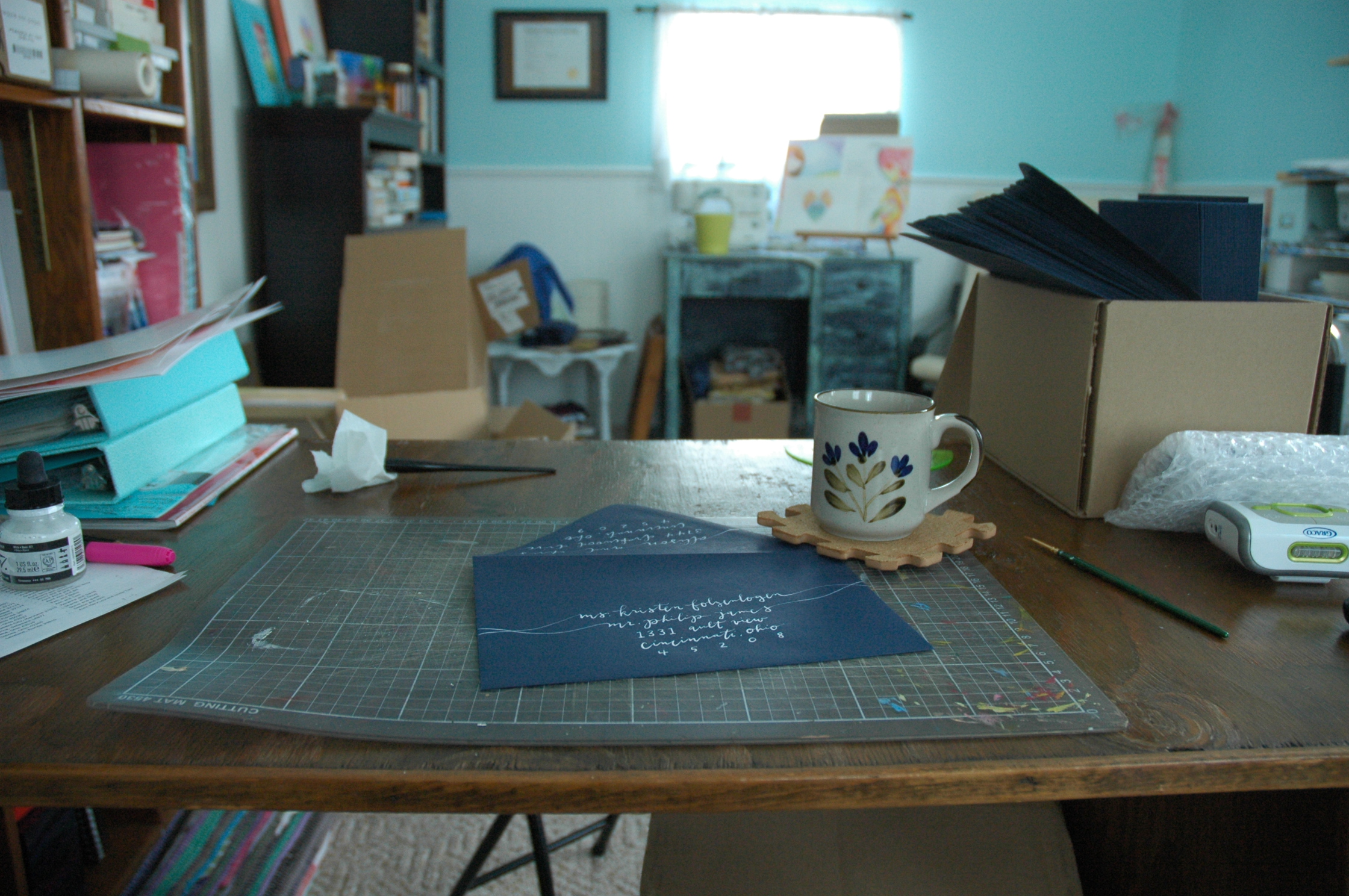
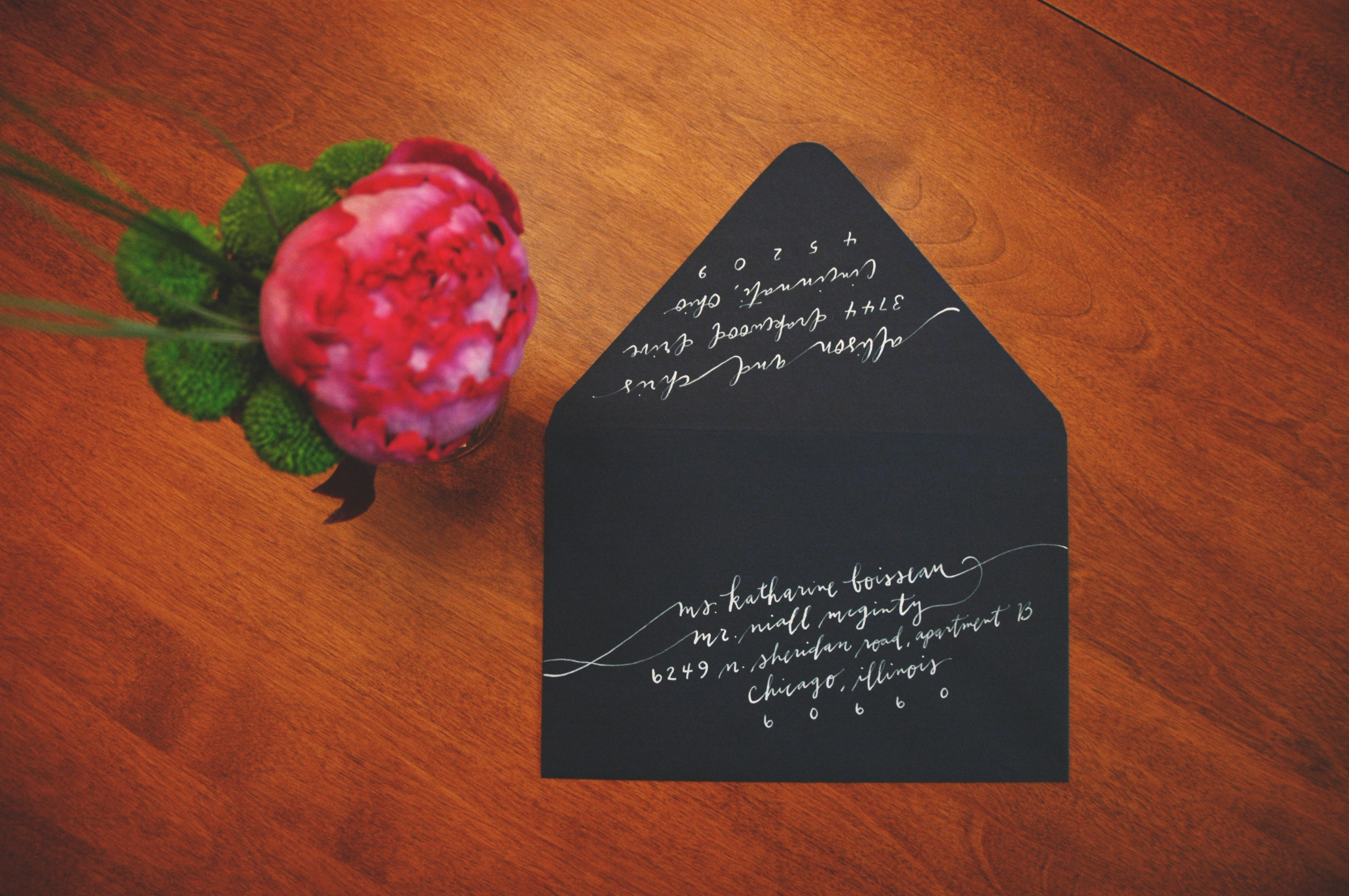
This month I had the pleasure of collaborating with Rochester Brainery & Joe Bean Coffee on a First Friday show of 20 calligraphy pieces. Each piece featured a haiku written by fellow Rochesterians about places around the city. It was incredibly fun to see the variety of inspiration drawn from familiar parks and establishments, & i think a lot of that was reflected in the collective individuality of the corresponding artwork. 

The show is up until the end of November, so please stop by to view the collection before they all go their separate ways. More than half of the show has already been auctioned off to provide free seats to several Brainery classes. And (shameless self-promotion), check out this December workshop that I'll be teaching! I will be sharing my favorite resources, materials, & techniques, AND you'll be taking home a handful of envelopes and writing tools. :) Get prepared for that holiday card writing!
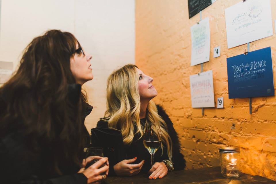
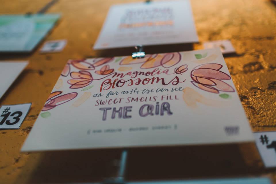
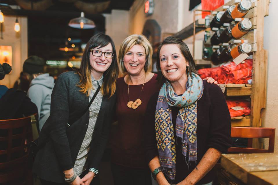
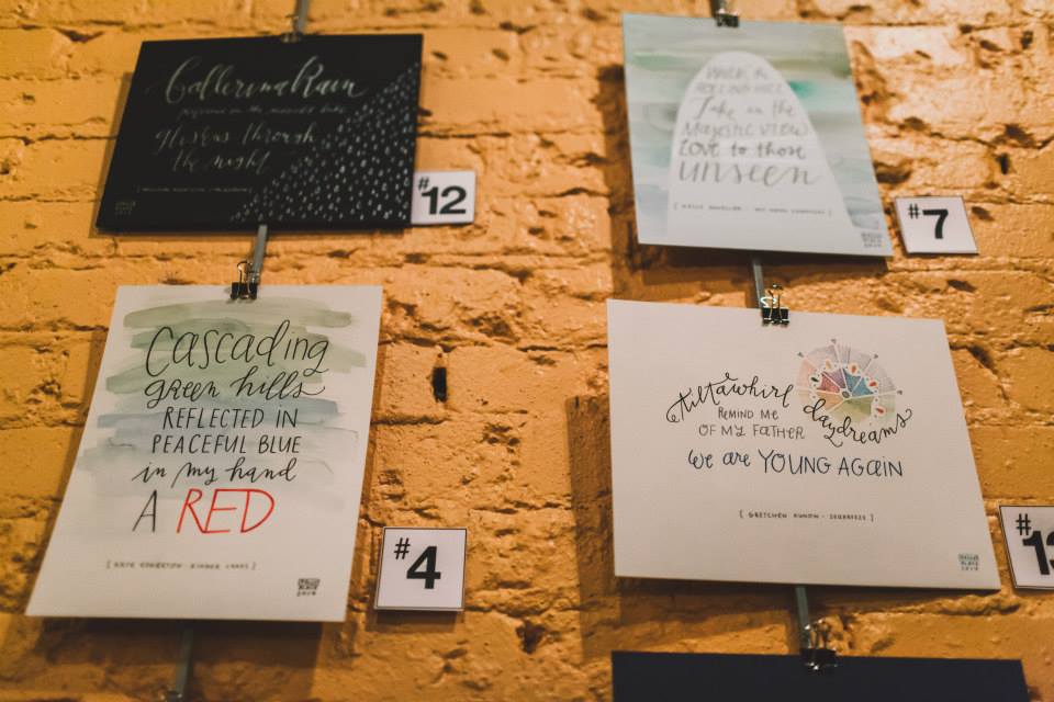
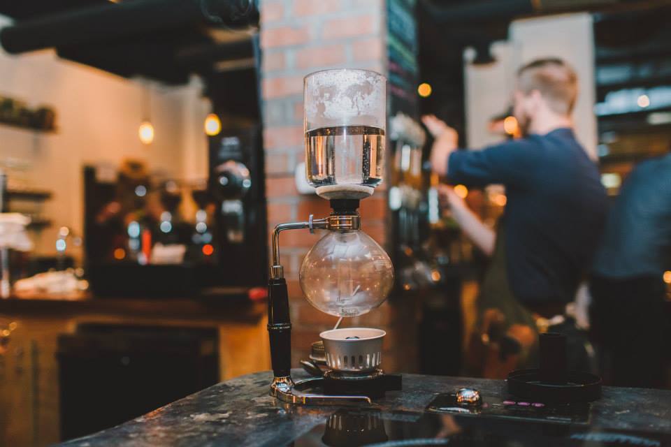
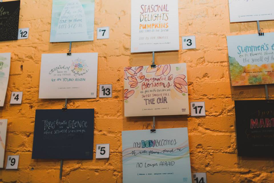
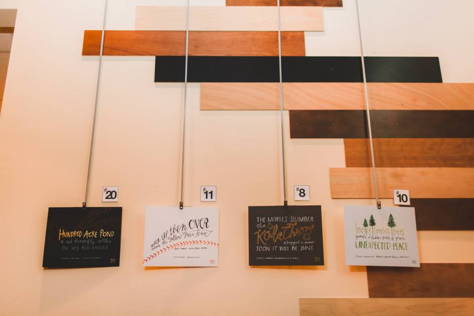
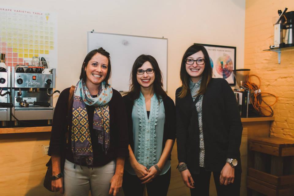
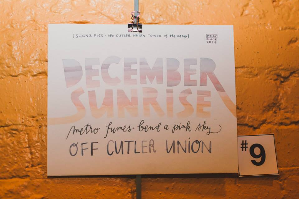
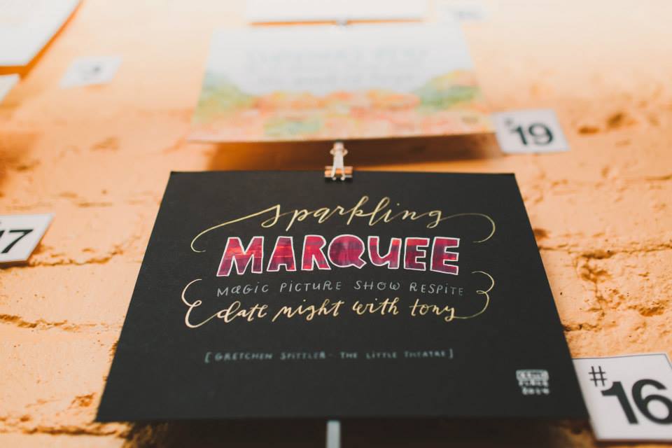
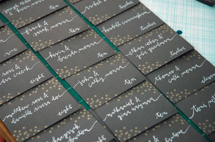
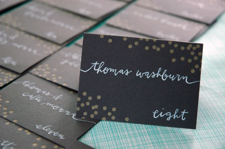
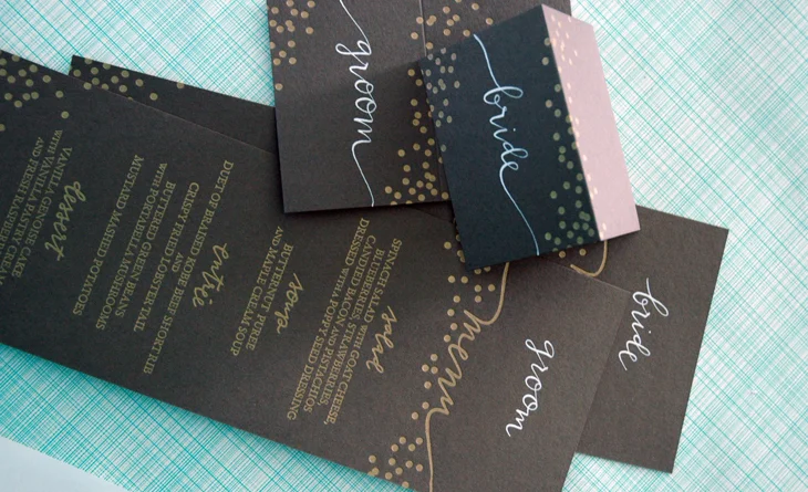
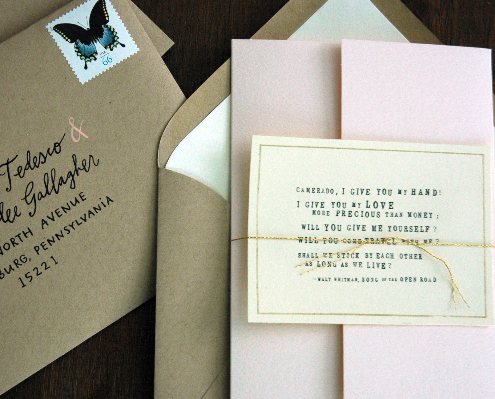
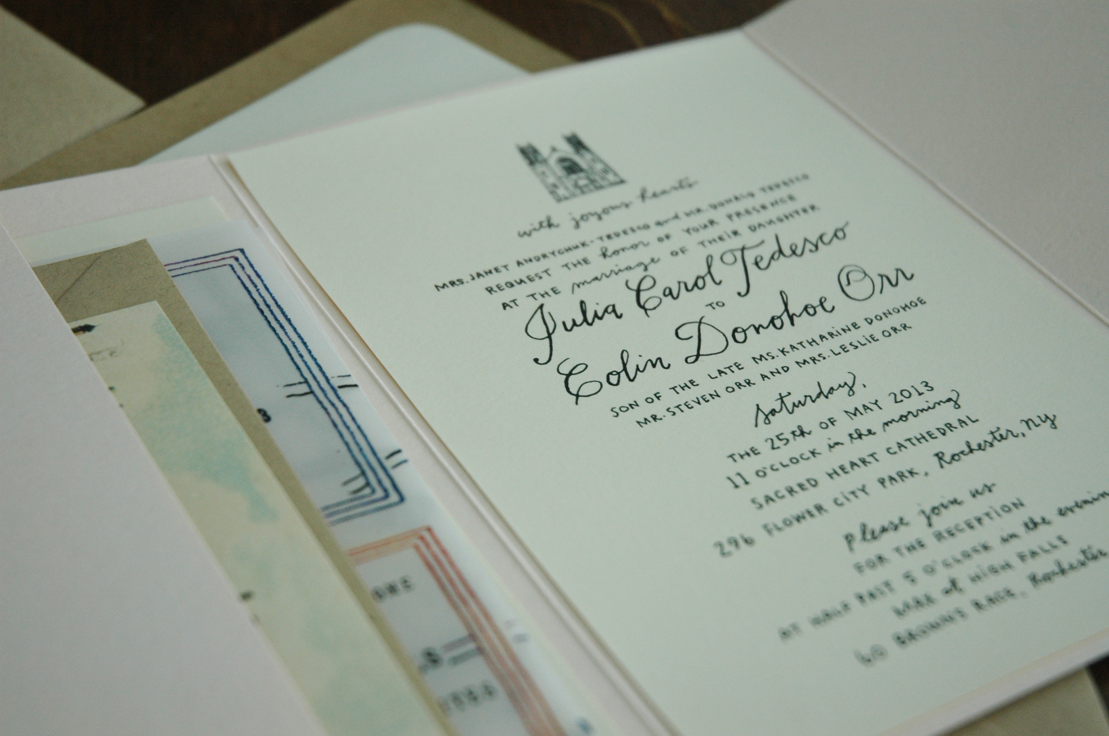
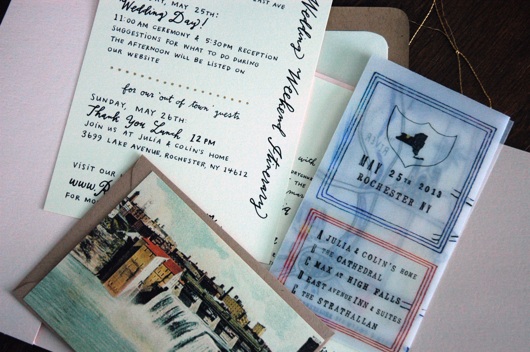
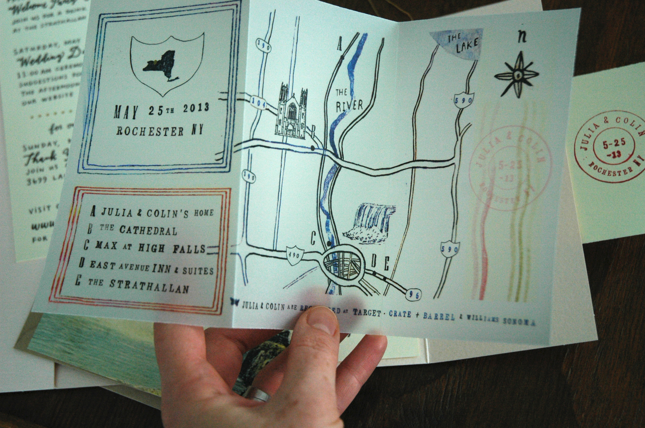
a dip pen kind of winter

If i'm going to be stuck inside, i'd rather be playing with bottles of colorful ink than counting the minutes until spring finally sticks. It has already proven to be a busy year for wedding calligraphy.  I'm always excited to try new combinations of colors & envelopes, scripts & blocks. The trend lately seems to be a muted palette: lots of kraft, cream, gray, mint, & blush. I'm loving it! And how about those gold letterpressed confetti dots, courtesy of greengirlpress? So stinkin' pretty.

DSC_6125.JPG
DSC_6877.JPG
DSC_6582.JPG

chalkboard menu: revisiting colored pencil lettering

I have to say, it has been a few years since I've given much thought to colored pencil lettering, & I'm so glad to have had the chance to revisit an old favorite medium a few weeks ago. I had a custom order from one of my bridal calligraphy clients for a chalkboard menu to be framed at the reception. After experimenting with white charcoal, conte crayon, and several colored pencils, I decided on a Prismacolor premier colored pencil. Pretty standard. It worked great on the black illustration board that I bought & ended up looking remarkably similar to a chalkboard finish, without the impermanence. I'm thinking it might be time to work some pencil back into my watercolors!

chalkboardmenu.JPG

tribal + copper + calligraphy

Finished up a second complete set of my 'like a rock' pairing. Hand cut linoleum block print in copper & silver, hand painted tribal design frame, and hand sewn & designed linen 'rock' soft sculpture. I am in love with this graphic combination of elements: the modern frame with the natural simplicity of the sentiment and rock. likearockset2

Sent out a few envelope calligraphy samples today that I'm pretty excited about too.

poemecalligraphy

a most charming rochester wedding

I don't think I could have imagined a more lovely collaborative invitation than this. Each piece was given so much character, down to every last detail. Cecelia has a way of making magic happen with vellum, and is the only person I know that can give a building a cute personality.  This was just seriously fun to work on, and how pretty is that blush color?  Can't you just feel the love between these forever friends? julia4 DSC_3484

DSC_3486

julia3

hand (writing & warming)

I recently finished up a big calligraphy job for the absolute nicest former coworker, Allison, from my favorite stationery store.  It was easy to become interested in illustrating and designing specifically for the wedding industry while I was around the inspiring, fun, & talented ladies at Poême ; so obviously I was thrilled to work on these.  And I think I might like this slanted addressing, too. allisonenv2

allisonenv1

It is nice to see a bit of freedom in my schedule now, before another wave of invitations begin. I've been finding tiny bits of time here and there to work on some adorably small projects (notice how cute that sentence sounds?).  I whipped up this 'pair and a spare' set of mittens just last week for a lucky little lovebug.

ruthie1

DSC_3020

to our son, who is one!

Honestly, I just can't believe it's 2013. Really, truly. I spent all new year's eve thinking about where I was one year ago on that day: at home with michael, my parents & brothers, playing board games, counting minutes & contractions, and walking many laps around our kitchen. Who knew (we did. or at least hoped) that half a day later we would be snuggling our new son, and knowing in that moment that nothing else would ever steal our hearts away from that little boy. liam-favorite

Happy 1st birthday to you, Liam! You have made our hearts so full of joy, our lives so richly blessed, and our house just a little bit cuter.

liam-1stbdaySM

liambday-envcal

cake-1st

bunting&balloons

cake-eating

12mo

you're so kind!

New lino-cut thank you notes with kraft paper envelopes from last week's show.  Although I really love carving stamps by hand, I currently prefer printing them with ink pads rather than block printing ink.  Who knows, I may return to the traditional way if i decide to use a light ink on darker paper (and have room to spare on the floor while they dry), but for now this is oh so convenient. Oh, the beauty of being able to change my mind! I'm hoping to get them up in my etsy shop for the new year, along with a selection of sale cards from past seasons. Everyone loves a good deal, am I right? linotys

DSC_2077

And some photos from the RIT winter show last week.

rit-show2

rit-show1

A tiny original painting from last year that I finally framed.

inthedark

little kid parties (get it?)

Alright, I need to say this:  I have the coolest clients.  When I received a request for a custom sound of music/alpine/heidi party invitation, I couldn't say 'heck yes' fast enough. I think we reached a nice balance of having  an obvious theme, but not being completely over the top.  I am totally in love with that goat & I think I got some nice colors going on in the background watercolor, too.