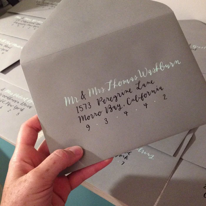
While this isn't a recent envelope, it was a favorite color scheme from this past year (mint & grey is my weakness) and it is one that makes me excited for new brides, new palettes, and new address calligraphy adventures for 2016. NOW, who needs me, and who will let me do fancy brush lettering? What do we all think of the new pantone colors for this year?!
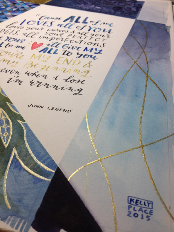
All of me & all of the blues and golds
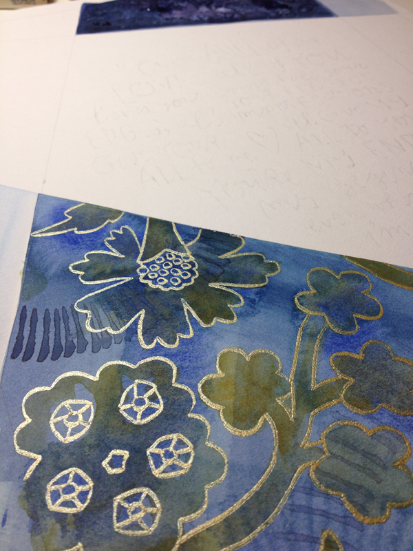
This palette totally gets me. When I caught wind of the colors of this wedding & heard mention of the first dance song, my mind was already swirling with a mix of geometric and organic patterns in blues & golds. The lyrics I chose to use were just begging to be lettered into some modular illustration, and I would be lying if i said i wasn't a sucker for the traditional diamond wedding reference. The gold calligraphy accents have been a thing for me in 2015, and because I was recently gifted a new set of Finetec gold watercolor pans, i anticipate this young love budding into something truly magical!
(Also, first post of 2016 in the books! Not a resolution, but I'm doing my best, haha)


tiffany blue for every bride
This has to be one of my favorite color & style combinations, yet. This tiffany, robin's egg blue was so fresh & carefree feeling with the tails extending off the envelope. While I don't have a sample set of the entire ensemble in hand, it was paired with a beautiful letterpress invite overflowing with pattern and coral accents- stunning!


paint in gem tones anyway
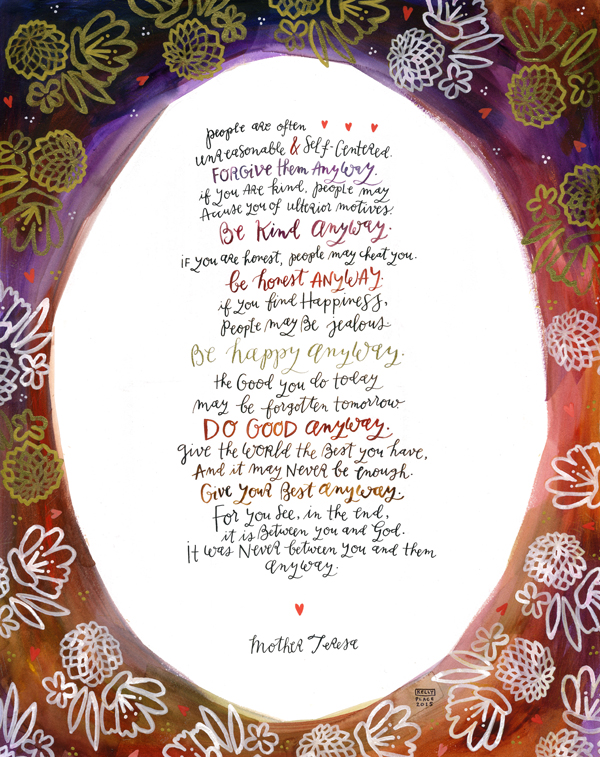
This summer I was asked to do two very special pieces for a fellow RIT Alumnus. Working larger than my usual size, they were definitely a welcome challenge. For the Mother Teresa quote, I carved a linoleum block stamp to use over a raw edge watercolor border. It was a mixed technique experiment that pleasantly surprised me, & one that I definitely think suited the author. The second piece was custom vow artwork, co-written by the very sweet Mr. & Mrs. (I'll keep those sentiments mostly private, but there are some snippets shown below).
Calligraphy & Illustrations done with watercolor, gouache, & ink. Sized 18x24" and 16x20" on watercolor board.


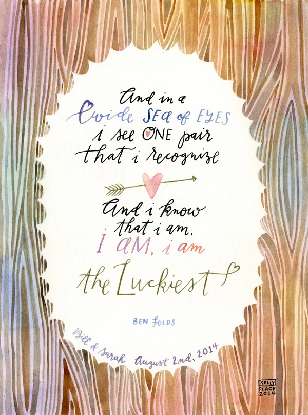
the luckiest
I am going to have a truthful moment with you all right now: posting in a timely fashion is not a strength of mine. This custom song lyric piece is so far past due, that I am literally slumping in my chair just considering that this is my first update since November. To my dedicated subscribers- Thank you, & I'm still here!
This watercolor calligraphy piece was done at the request of an extremely kind former client, who wanted a special wedding gift for her friend. The wedding was to the tune of a charmingly rustic, pastel, garden party theme. If i do say so myself, I think even Ben Folds would feel all the heart flutters.


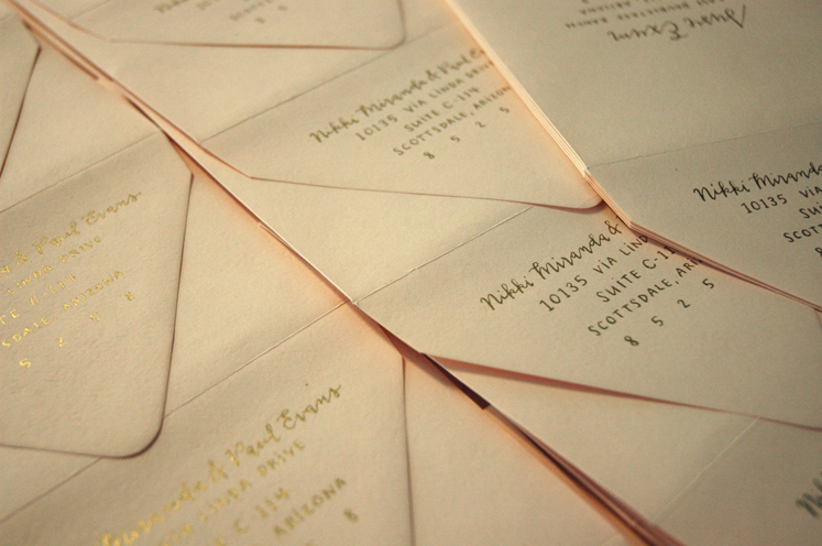
it's golden from where i sit
Lately I've been feeling just so blessed to be able to work from home, even if it only amounts to 15 minutes of real productive time until the boys are in bed. When I look at Liam's little play area on the other side of the studio baby-gate barrier, I can't help but laugh at how both spaces are full of so much love and chaos. There is no such thing as order in this shared room when it's time to play with paper & ink or cars & trucks.
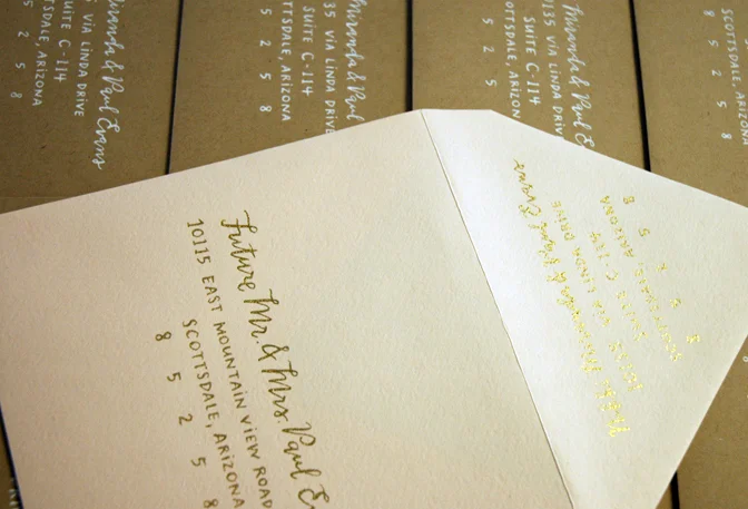
I just finished a seriously fun bunch of wedding envelopes this month. I found a new favorite gold ink & was thrilled with how it turned out on some very beautiful luxe blush envelopes. This was the second wedding suite that I did calligraphy for with Ilana of Sugar and Type, the first of which was just featured on the Oh So Beautiful Paper blog today! I am obviously thrilled and flattered!

my golden haired boy. i love him so much. when I look at this photo I like to pretend he was interested in watching me work, but he was just waiting for me to play the lion king soundtrack.