While this isn't a recent envelope, it was a favorite color scheme from this past year (mint & grey is my weakness) and it is one that makes me excited for new brides, new palettes, and new address calligraphy adventures for 2016. NOW, who needs me, and who will let me do fancy brush lettering? What do we all think of the new pantone colors for this year?!
tiffany blue for every bride
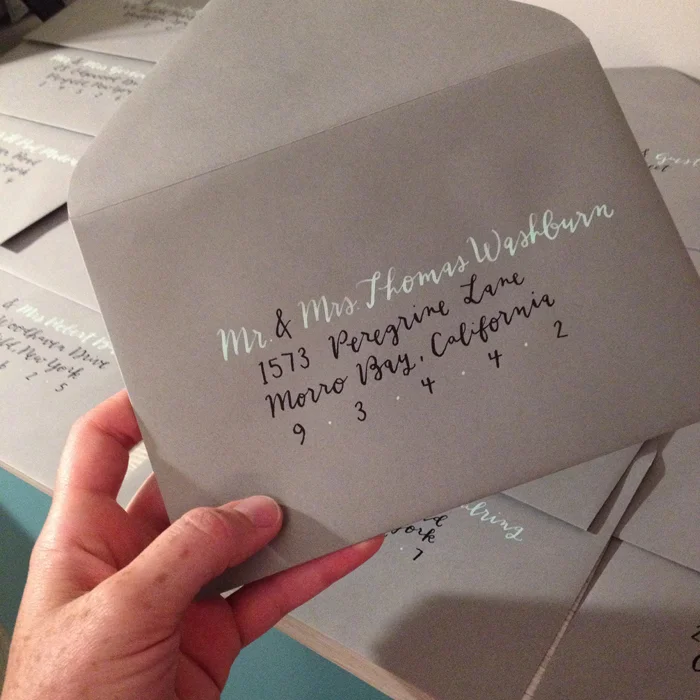
This has to be one of my favorite color & style combinations, yet. This tiffany, robin's egg blue was so fresh & carefree feeling with the tails extending off the envelope. While I don't have a sample set of the entire ensemble in hand, it was paired with a beautiful letterpress invite overflowing with pattern and coral accents- stunning!


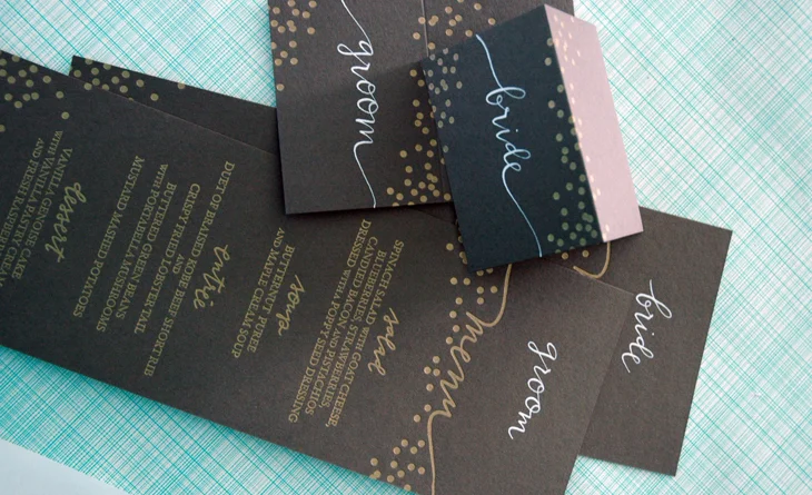
chalkboard menus & escort cards
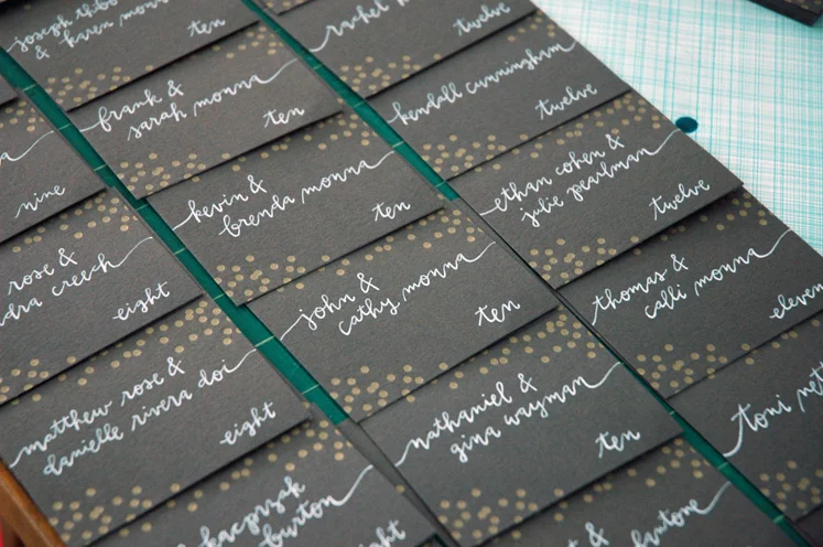
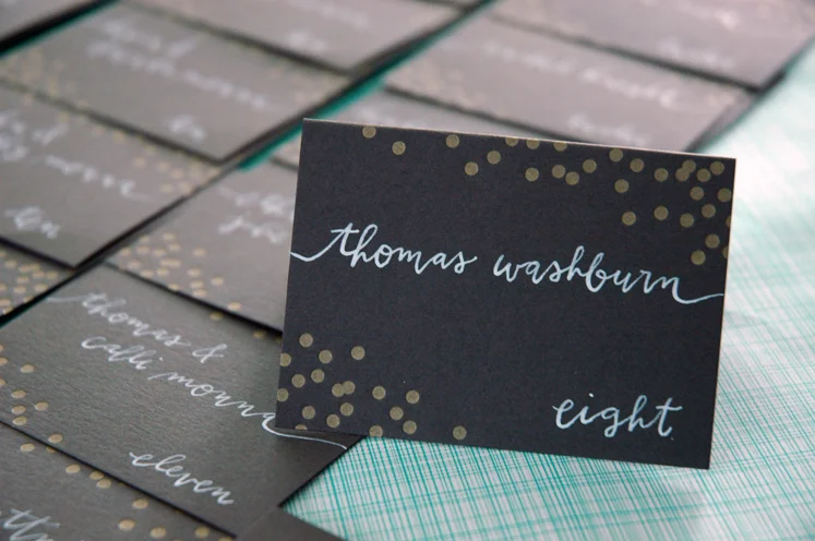
Just finished up this set of chalkboard-esque escort cards and menus. Can we all agree that the charcoal and gold combo is just so classic looking & glamorous? I also don't mind seeing my calligraphy letterpressed, either. So cool, greengirlpress!
it's golden from where i sit
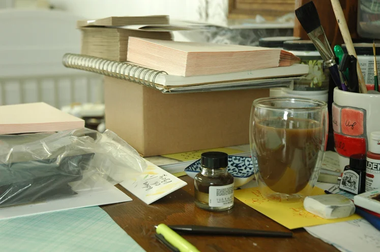
Lately I've been feeling just so blessed to be able to work from home, even if it only amounts to 15 minutes of real productive time until the boys are in bed. When I look at Liam's little play area on the other side of the studio baby-gate barrier, I can't help but laugh at how both spaces are full of so much love and chaos. There is no such thing as order in this shared room when it's time to play with paper & ink or cars & trucks.
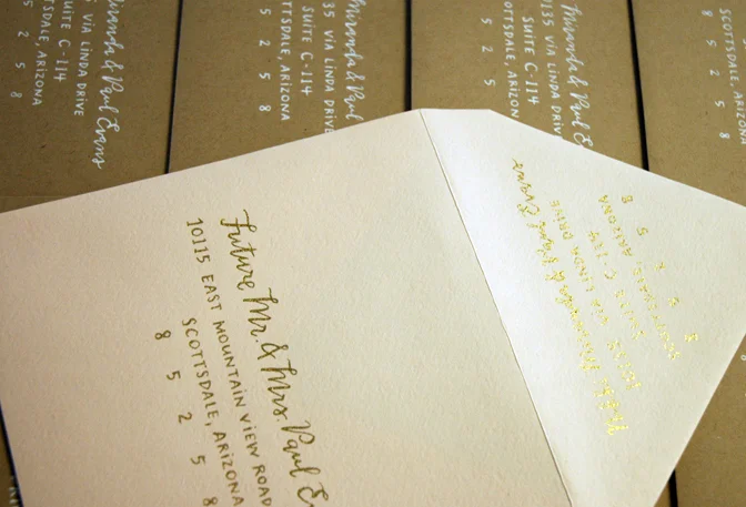
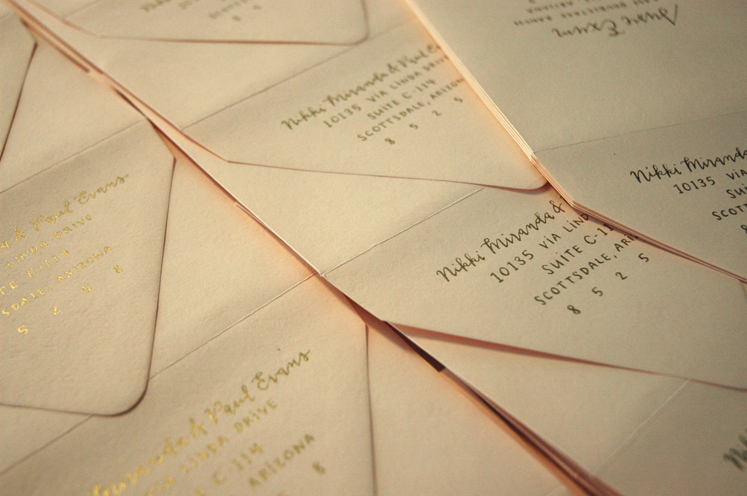
I just finished a seriously fun bunch of wedding envelopes this month. I found a new favorite gold ink & was thrilled with how it turned out on some very beautiful luxe blush envelopes. This was the second wedding suite that I did calligraphy for with Ilana of Sugar and Type, the first of which was just featured on the Oh So Beautiful Paper blog today! I am obviously thrilled and flattered!

my golden haired boy. i love him so much. when I look at this photo I like to pretend he was interested in watching me work, but he was just waiting for me to play the lion king soundtrack.