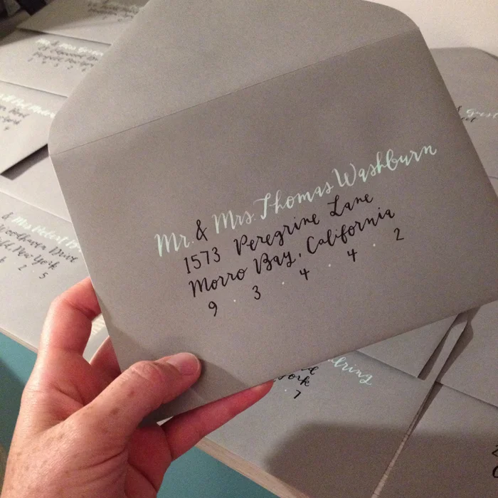
While this isn't a recent envelope, it was a favorite color scheme from this past year (mint & grey is my weakness) and it is one that makes me excited for new brides, new palettes, and new address calligraphy adventures for 2016. NOW, who needs me, and who will let me do fancy brush lettering? What do we all think of the new pantone colors for this year?!
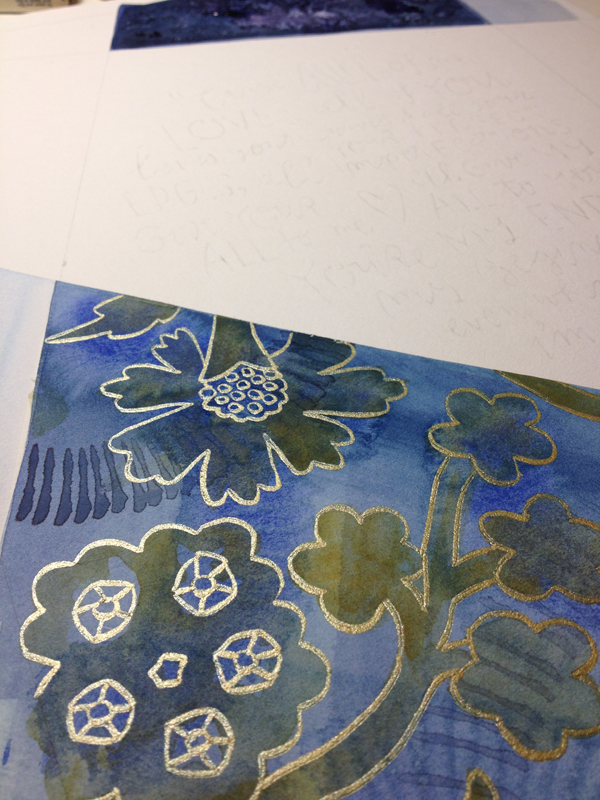
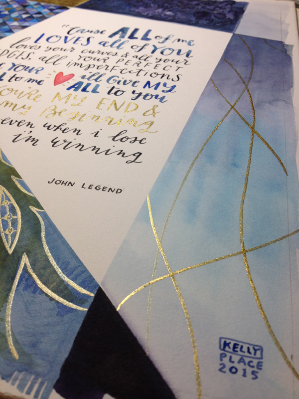
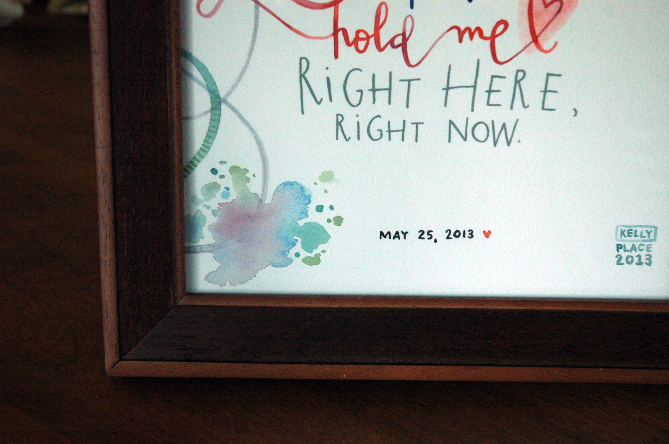
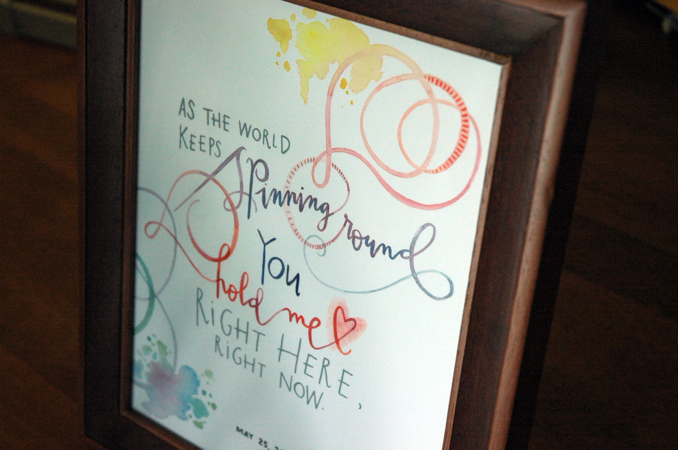
All of me & all of the blues and golds
This palette totally gets me. When I caught wind of the colors of this wedding & heard mention of the first dance song, my mind was already swirling with a mix of geometric and organic patterns in blues & golds. The lyrics I chose to use were just begging to be lettered into some modular illustration, and I would be lying if i said i wasn't a sucker for the traditional diamond wedding reference. The gold calligraphy accents have been a thing for me in 2015, and because I was recently gifted a new set of Finetec gold watercolor pans, i anticipate this young love budding into something truly magical!
(Also, first post of 2016 in the books! Not a resolution, but I'm doing my best, haha)


tiffany blue for every bride
This has to be one of my favorite color & style combinations, yet. This tiffany, robin's egg blue was so fresh & carefree feeling with the tails extending off the envelope. While I don't have a sample set of the entire ensemble in hand, it was paired with a beautiful letterpress invite overflowing with pattern and coral accents- stunning!


paint in gem tones anyway
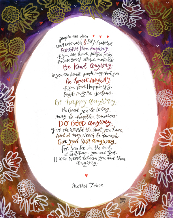
This summer I was asked to do two very special pieces for a fellow RIT Alumnus. Working larger than my usual size, they were definitely a welcome challenge. For the Mother Teresa quote, I carved a linoleum block stamp to use over a raw edge watercolor border. It was a mixed technique experiment that pleasantly surprised me, & one that I definitely think suited the author. The second piece was custom vow artwork, co-written by the very sweet Mr. & Mrs. (I'll keep those sentiments mostly private, but there are some snippets shown below).
Calligraphy & Illustrations done with watercolor, gouache, & ink. Sized 18x24" and 16x20" on watercolor board.


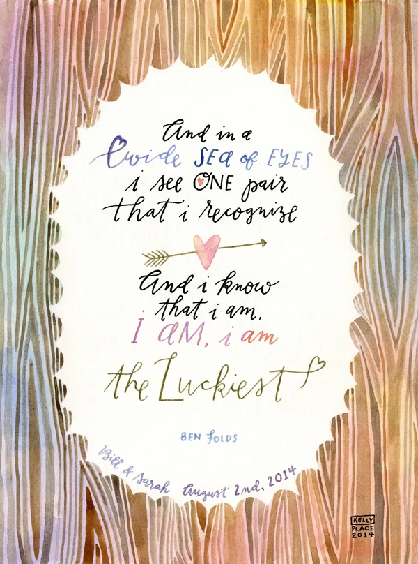
the luckiest
I am going to have a truthful moment with you all right now: posting in a timely fashion is not a strength of mine. This custom song lyric piece is so far past due, that I am literally slumping in my chair just considering that this is my first update since November. To my dedicated subscribers- Thank you, & I'm still here!
This watercolor calligraphy piece was done at the request of an extremely kind former client, who wanted a special wedding gift for her friend. The wedding was to the tune of a charmingly rustic, pastel, garden party theme. If i do say so myself, I think even Ben Folds would feel all the heart flutters.


agrotourism themed wedding shoot
When I look at these photos, one of the first things I think to myself is: "can I please get a do-over of my wedding?! Pretty please?". Because honestly, how breathtaking and whimsical are the colors and details of this mock wedding?! I am so honored to have been asked to contribute paper goods for this styled organic farm shoot, & so lucky to have done so amongst some serious talent. Carla over at Costamagna Design was the genius behind the design, & the stunning photos were taken by Jenn & Ben of Ayres Photography (I promise to share the other contributing parties once I have a full list).
I'm convinced. Farms + brightly colored quilts & flowers + tents & light garlands + food & drink stations = pure wedding bliss.
Photo credit: Ayres Photography; Invitations & Calligraphy: Kelly Place
Photo credit: Ayres Photography; Invitations & Calligraphy: Kelly Place
Photo credit: Ayres Photography; Invitations & Calligraphy: Kelly Place
Photo credit: Ayres Photography
Photo credit: Ayres Photography
Photo credit: Ayres Photography
Photo credit: Ayres Photography
Photo credit: Ayres Photography
Photo credit: Ayres Photography; Sign: Kelly Place
Photo credit: Ayres Photography
Photo credit: Ayres Photography
Photo credit: Ayres Photography
Photo credit: Ayres Photography; Farm to table menu: Kelly Place
Photo credit: Ayres Photography
Photo credit: Ayres Photography
Photo credit: Ayres Photography; Cocktail menu: Kelly Place
Photo credit: Ayres Photography
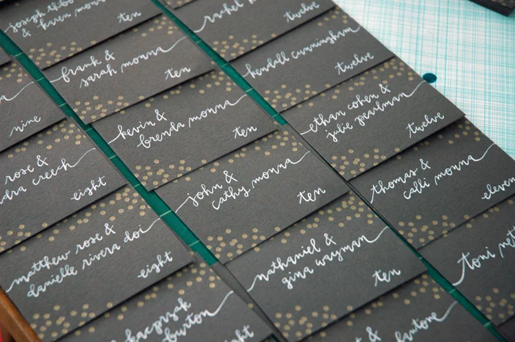
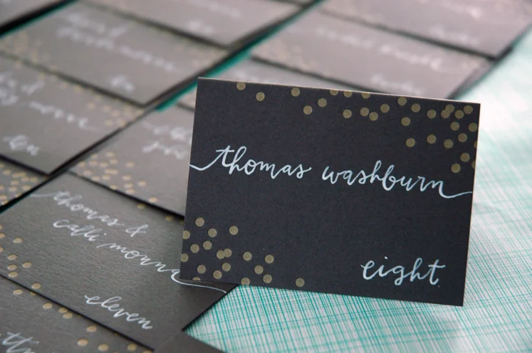
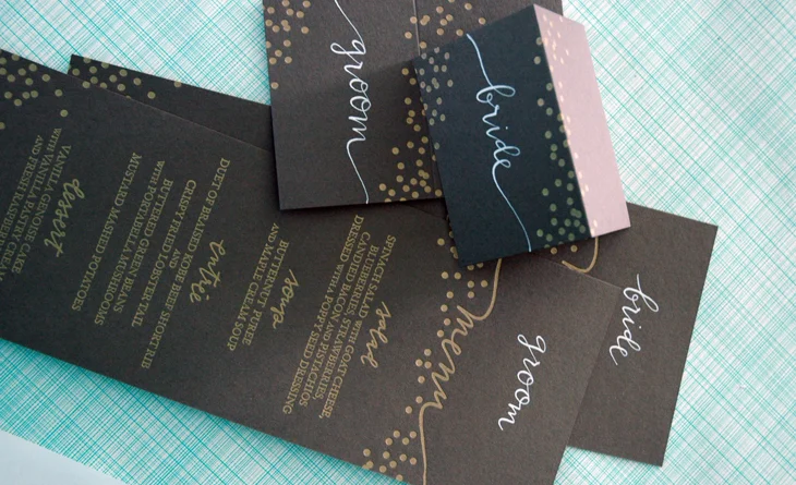
chalkboard menus & escort cards
Just finished up this set of chalkboard-esque escort cards and menus. Can we all agree that the charcoal and gold combo is just so classic looking & glamorous? I also don't mind seeing my calligraphy letterpressed, either. So cool, greengirlpress!
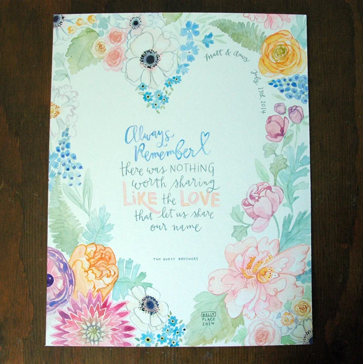
paint all the flowers
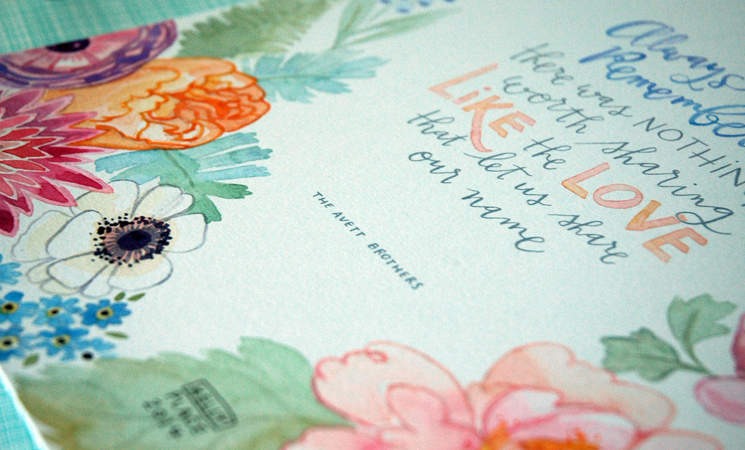
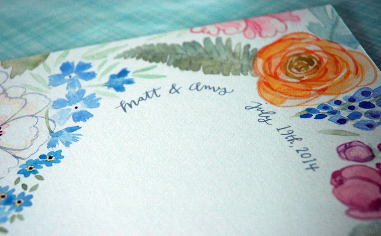
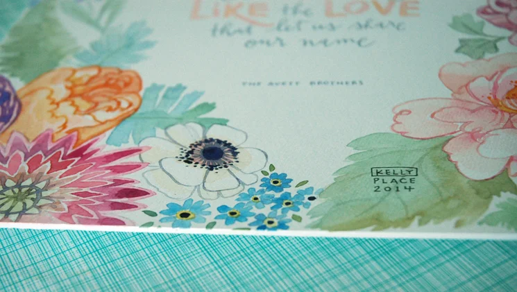
This has to be THE most floral piece I have ever done. It also has to be one of my favorite floral watercolors ever. I think it's the combination of the graphic negative space, the colors, the variety of flowers, & obviously The Avett Brothers. Plus, it is going to one seriously cool bride. I'm working on some other 'day-of' things for her now, and I just can't wait to see photos of everything put together. I anticipate it being one stunning wedding day.
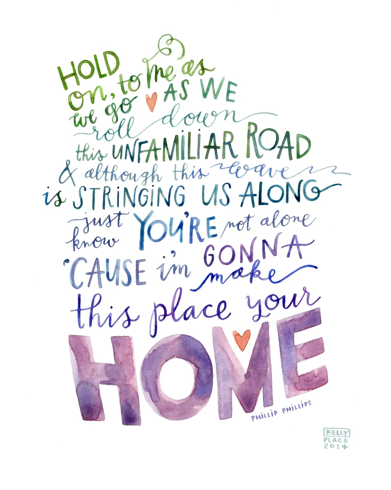
home
Can I just say, illustrating first dance song lyrics is one of my favorite things. There is such a wide variety in sentiment, wedding style, and the personalities of the bride & groom. The combination of all of those things into one piece is part challenge, part surprise, and always just plain fun. There's something so nice about having a memento for your home that doesn't have to read as wedding-themed, but is just as significant.
A piece for some very dear friends of ours, who I hope are blessed with a lifetime of love & laughter!
it's golden from where i sit
Lately I've been feeling just so blessed to be able to work from home, even if it only amounts to 15 minutes of real productive time until the boys are in bed. When I look at Liam's little play area on the other side of the studio baby-gate barrier, I can't help but laugh at how both spaces are full of so much love and chaos. There is no such thing as order in this shared room when it's time to play with paper & ink or cars & trucks.
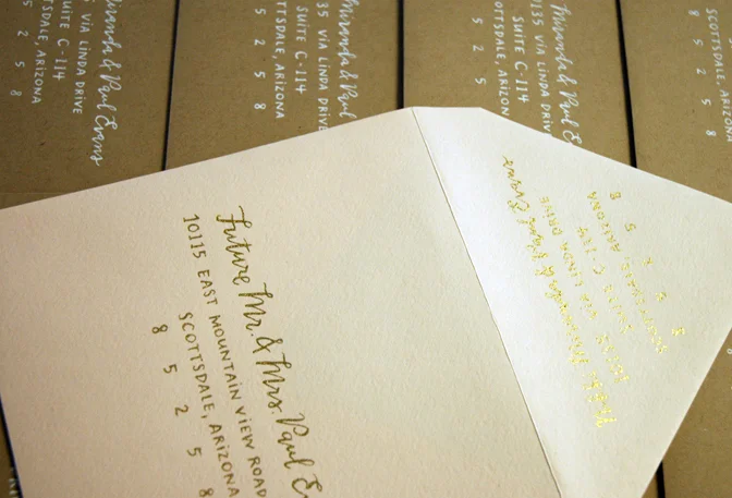
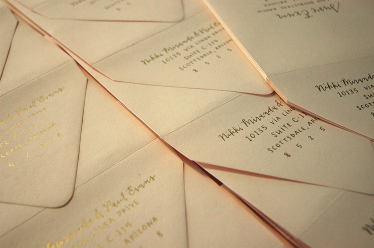
I just finished a seriously fun bunch of wedding envelopes this month. I found a new favorite gold ink & was thrilled with how it turned out on some very beautiful luxe blush envelopes. This was the second wedding suite that I did calligraphy for with Ilana of Sugar and Type, the first of which was just featured on the Oh So Beautiful Paper blog today! I am obviously thrilled and flattered!

my golden haired boy. i love him so much. when I look at this photo I like to pretend he was interested in watching me work, but he was just waiting for me to play the lion king soundtrack.
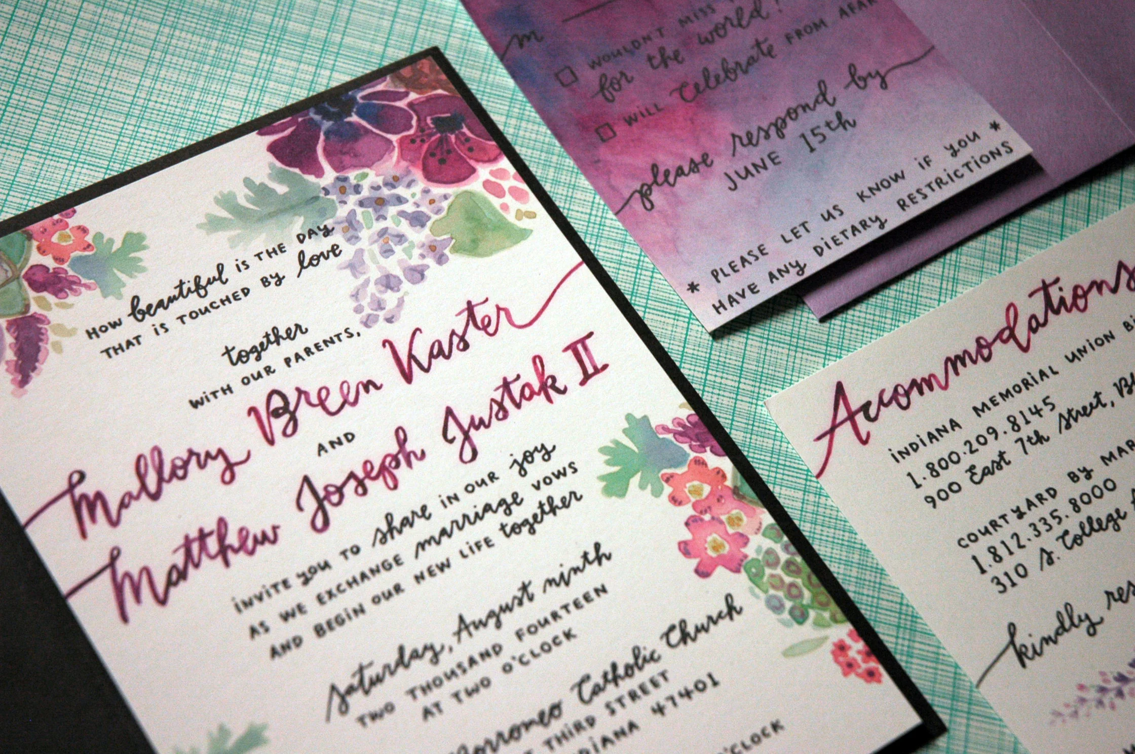
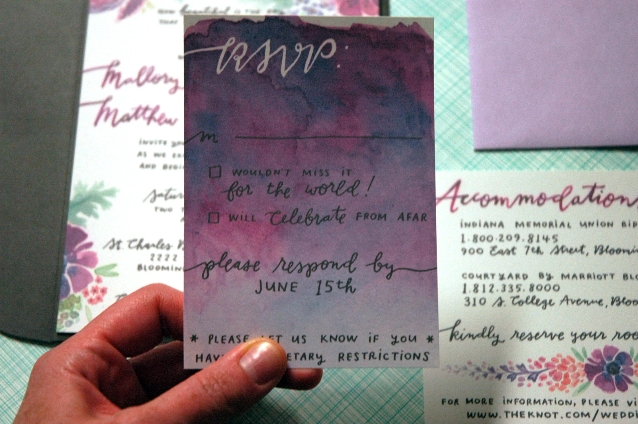
radiant orchid watercolor suite
Now this is a trend I can get on board with: the abundance of pantone's 2014 color of the year for this wedding season! The radiant orchid inspired palette is my new love. This invitation ensemble was so wonderful to work on, I'm afraid I will never stray from my current purple anemone & lilac obsession. Or at least I will never tire of painting flowers. We will find out after my next calligraphy project, that's for sure!
a dip pen kind of winter
If i'm going to be stuck inside, i'd rather be playing with bottles of colorful ink than counting the minutes until spring finally sticks. It has already proven to be a busy year for wedding calligraphy. I'm always excited to try new combinations of colors & envelopes, scripts & blocks. The trend lately seems to be a muted palette: lots of kraft, cream, gray, mint, & blush. I'm loving it! And how about those gold letterpressed confetti dots, courtesy of greengirlpress? So stinkin' pretty.


chalkboard menu: revisiting colored pencil lettering
I have to say, it has been a few years since I've given much thought to colored pencil lettering, & I'm so glad to have had the chance to revisit an old favorite medium a few weeks ago. I had a custom order from one of my bridal calligraphy clients for a chalkboard menu to be framed at the reception. After experimenting with white charcoal, conte crayon, and several colored pencils, I decided on a Prismacolor premier colored pencil. Pretty standard. It worked great on the black illustration board that I bought & ended up looking remarkably similar to a chalkboard finish, without the impermanence. I'm thinking it might be time to work some pencil back into my watercolors!

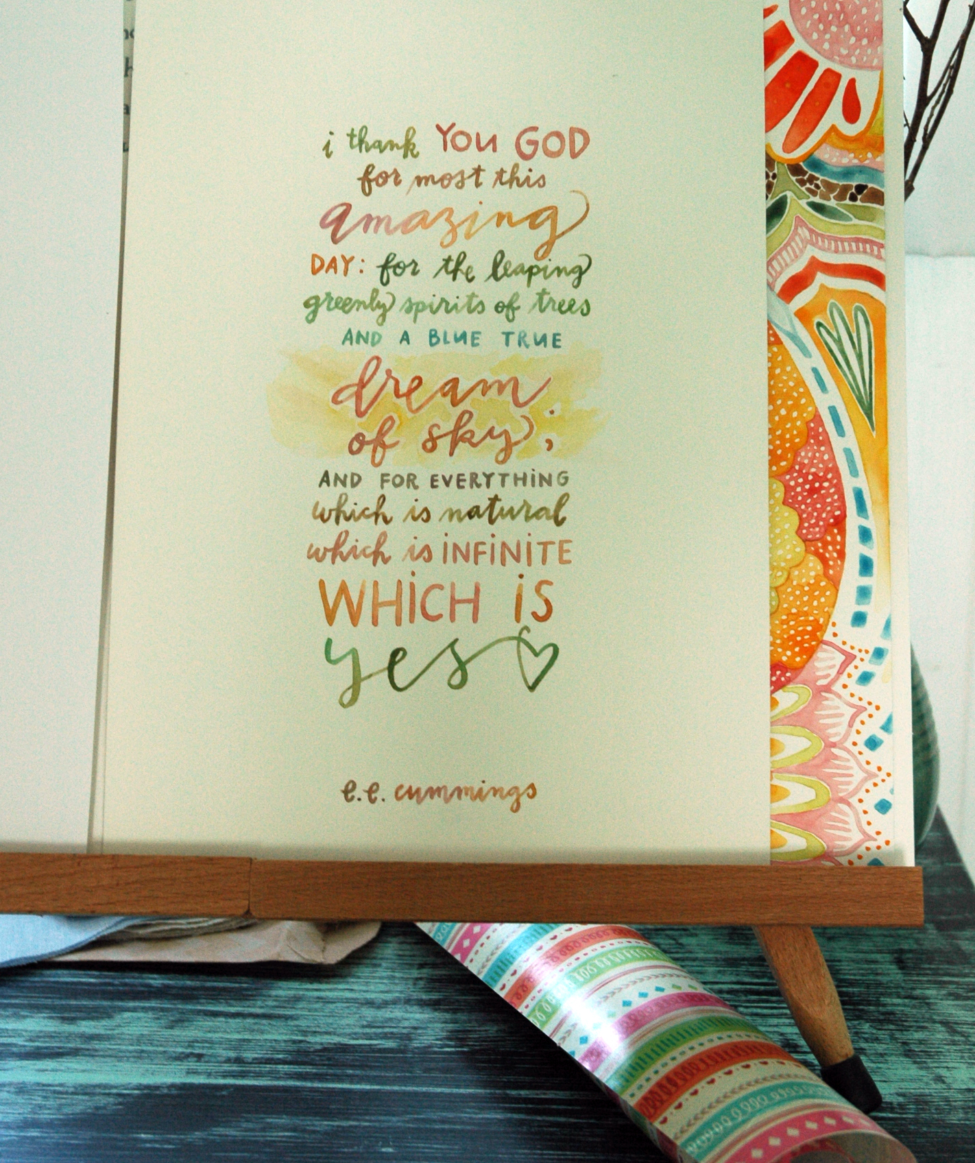
i thank you God
Oh, how I love doing calligraphy of e.e. cummings poems. I always feel that they lend themselves so well to different treatments of each line, and I love playing up the color variations with them too. This was for the cover of a wedding program for that beautiful Rochester wedding invite I helped work on. I'm hoping to get a photo of the menus I collaborated with Cecelia on, too. I imagine that all the lovely details of that day were just, YES. The very best wishes to the bride & groom!
lucky, for a friend
Last weekend was my first experience attending a greek wedding and, holy awesome, what a blast! I was so thrilled to celebrate with an old high school friend and her new love. They had a beautiful day, super joyous guests, and a pretty cute wedding song, too (lucky, by Jason Mraz)! Wishing them loads of happiness!
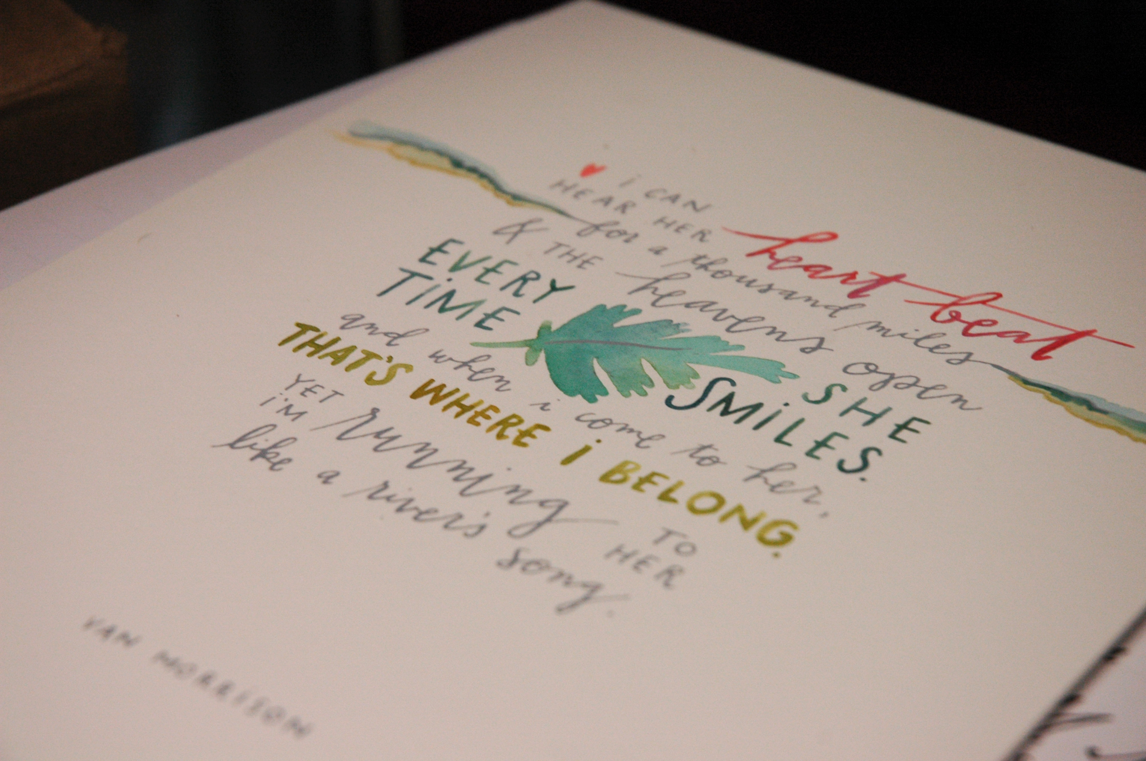
crazy love
There is a soft spot in my heart for Van Morrison when it comes to weddings. Michael and I had our first dance to a Van Morrison song, and when it comes right down to it, I'm just a fan. This was special request for a custom 'crazy love' calligraphy piece for a wedding card. And you know what? I dig it. That lone dusty miller leaf makes MY heart beat! I'm beginning to prefer gray ink over black ink lately, too. Anyone else with me on that one?
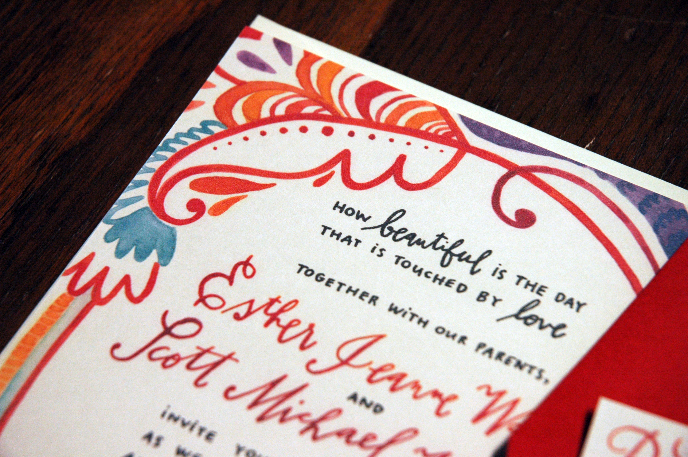
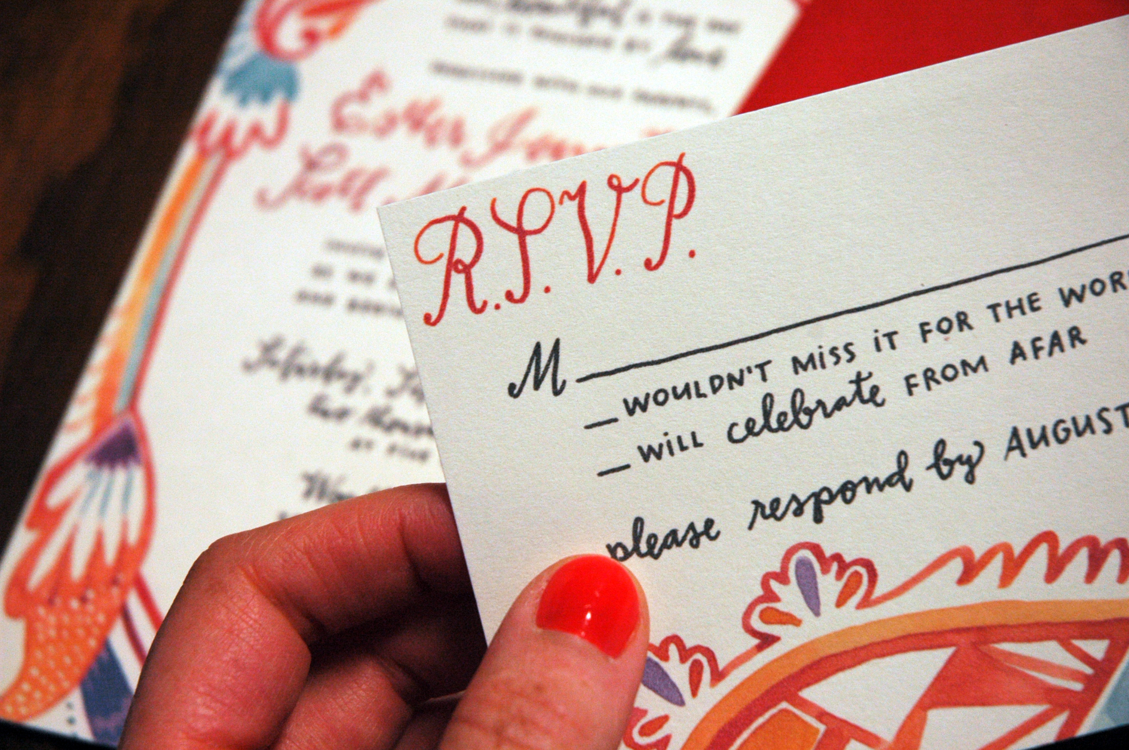
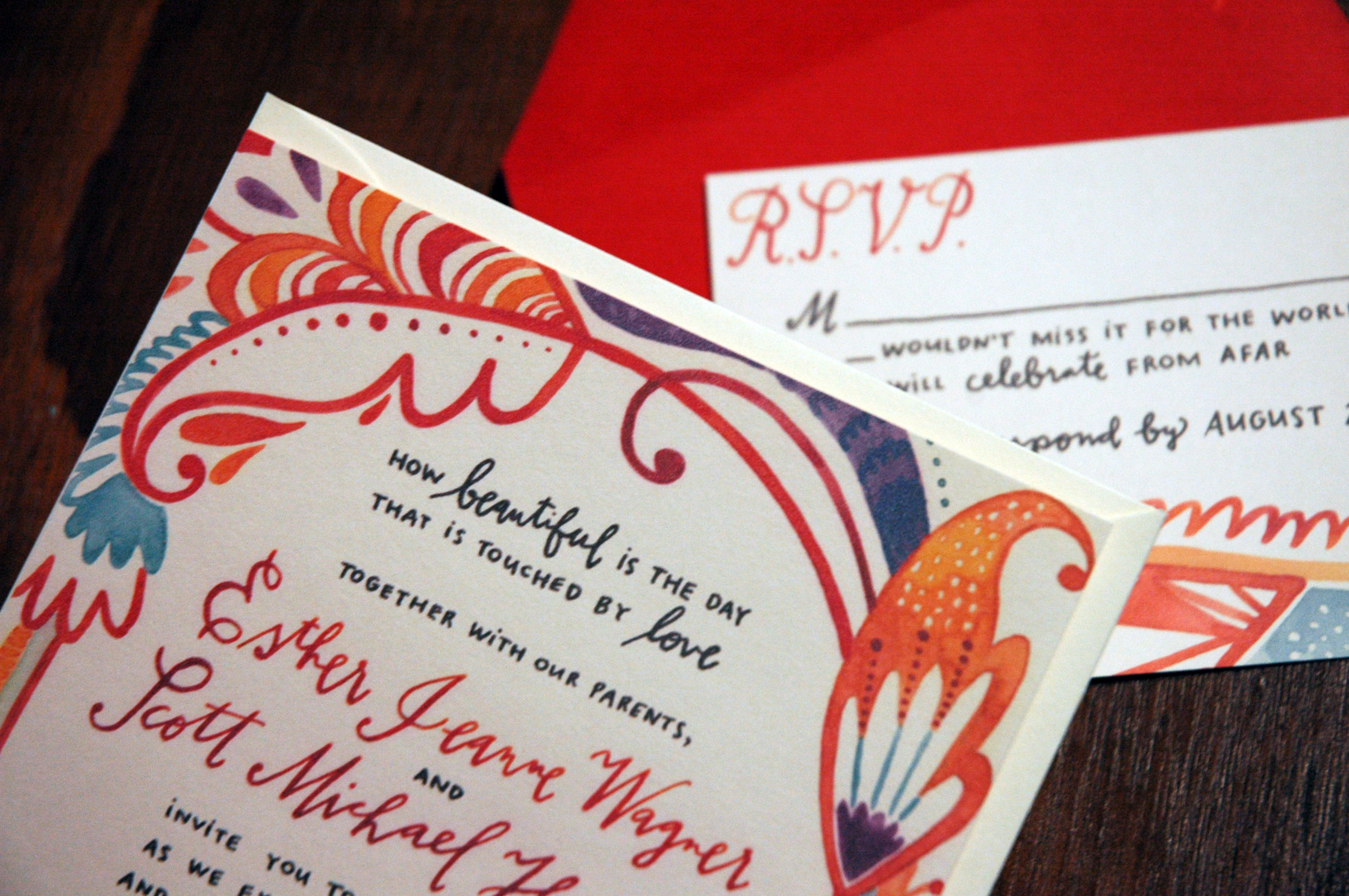
a pretty paisley wedding
This was a very fun wedding suite that I did for a plain awesome gal. She told me to run with a red orange color scheme, with some aqua & purple accents. I'm loving how happy and celebratory this turned out- I think I might have to utilize paisley more often!
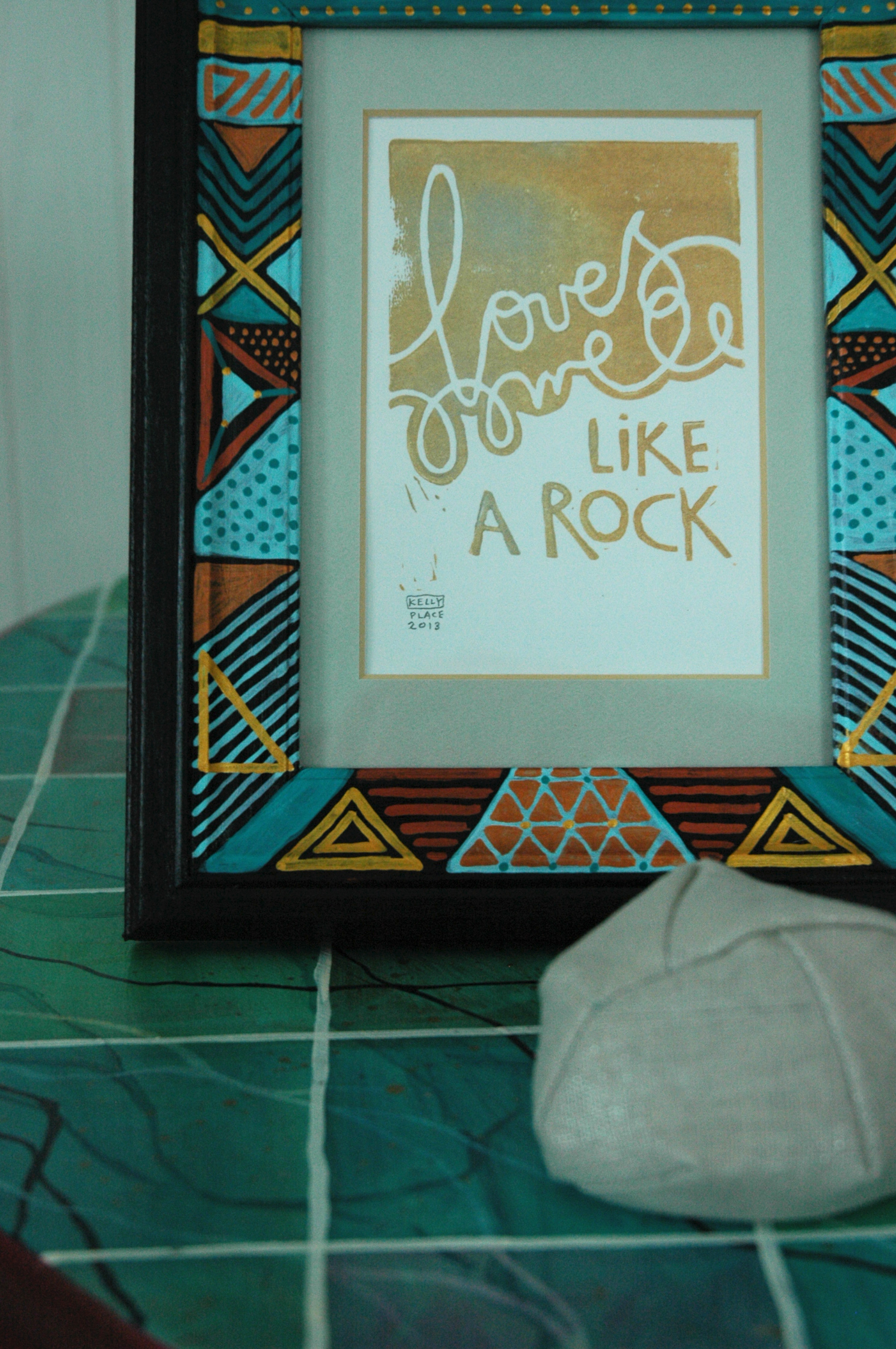
tribal + copper + calligraphy
Finished up a second complete set of my 'like a rock' pairing. Hand cut linoleum block print in copper & silver, hand painted tribal design frame, and hand sewn & designed linen 'rock' soft sculpture. I am in love with this graphic combination of elements: the modern frame with the natural simplicity of the sentiment and rock.
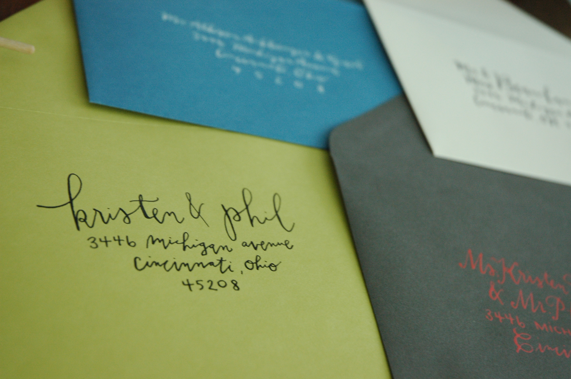
Sent out a few envelope calligraphy samples today that I'm pretty excited about too.
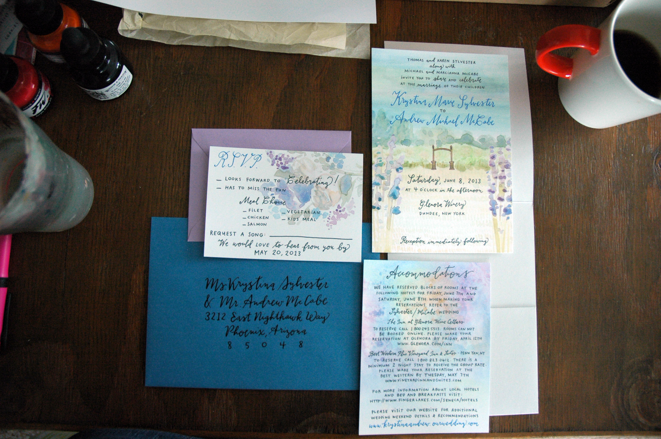
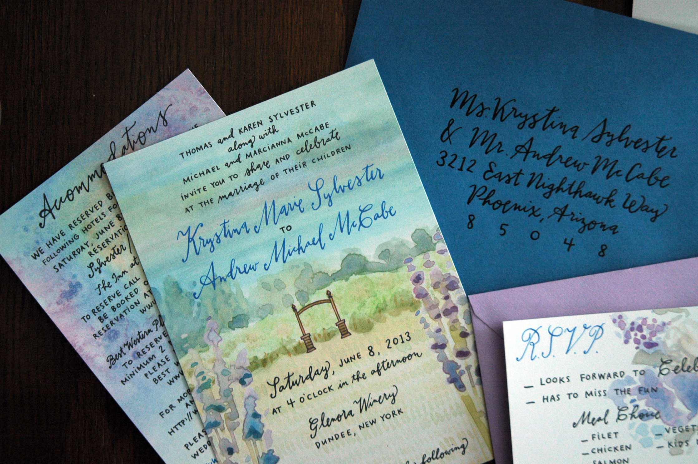
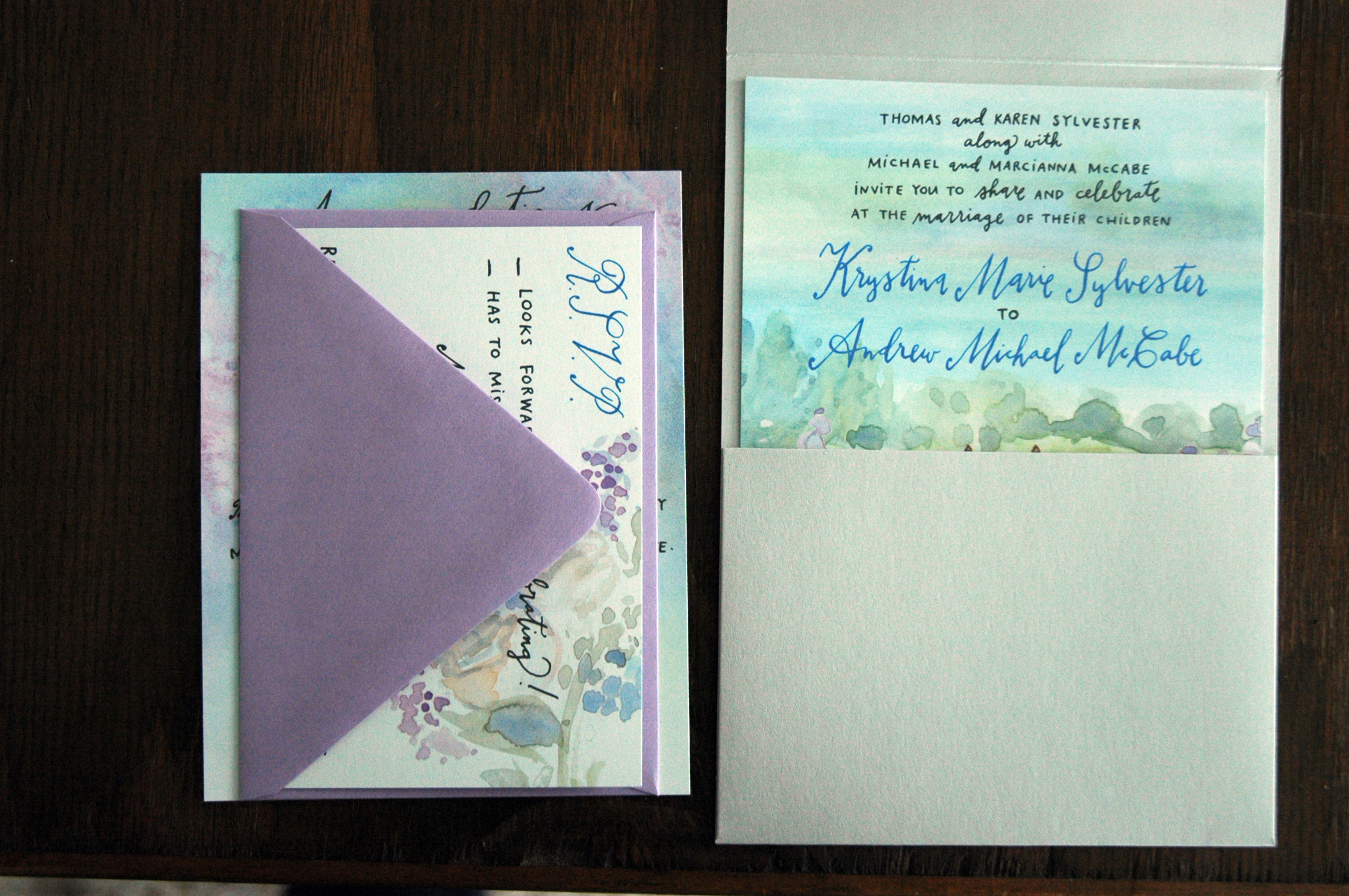
glenora winery wedding
Just finished up a very gardentastic wedding suite for a fellow RIT alumnus (and former resident!). The bride requested that I include the arbor at the winery where the ceremony will take place, and gave me a glimpse into the bridal bouquet inspiration. I love the combination of envelope colors she chose to go with the shimmer silver pocket, too - the lady has got taste! Oh, spring weddings are just so pretty!
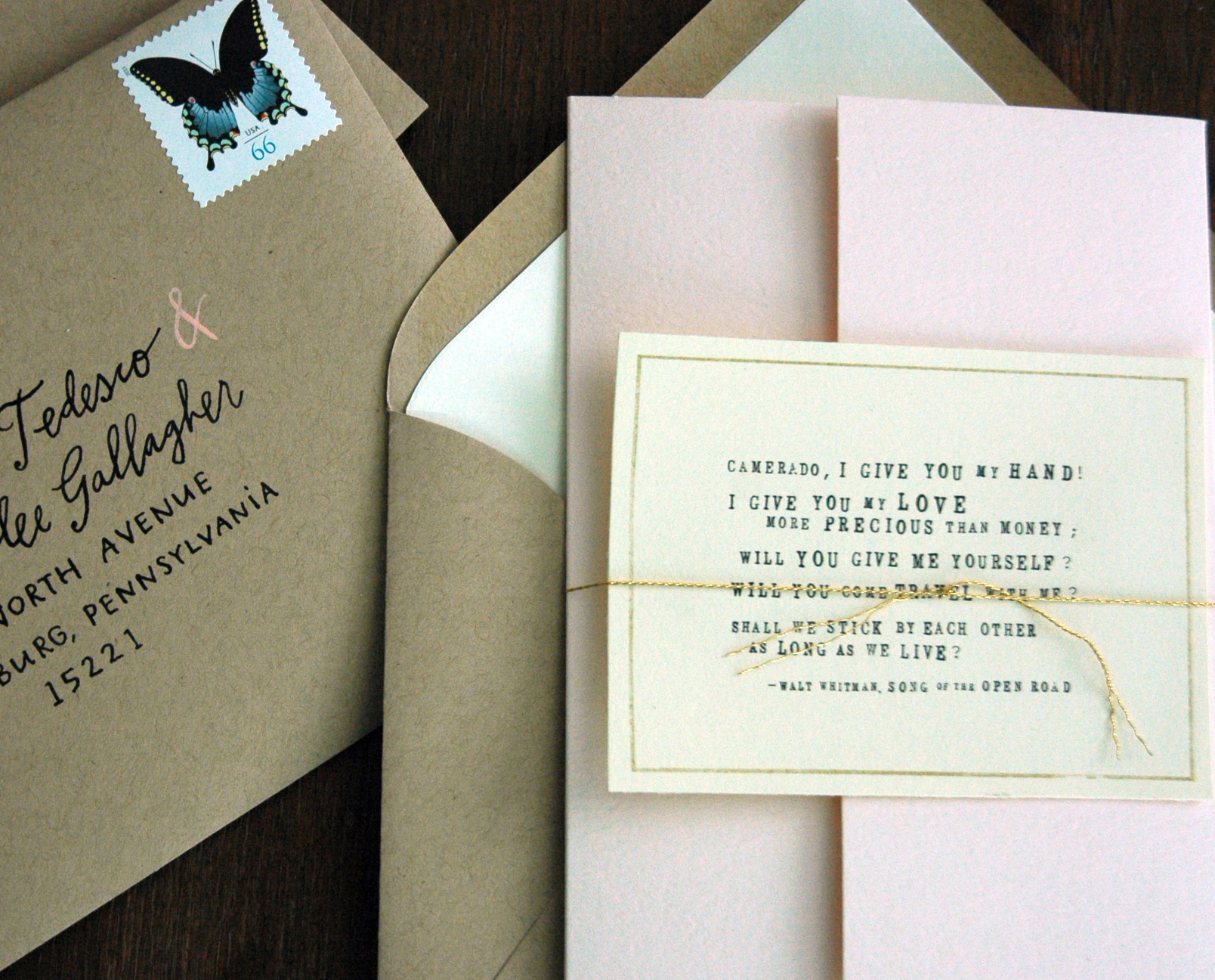
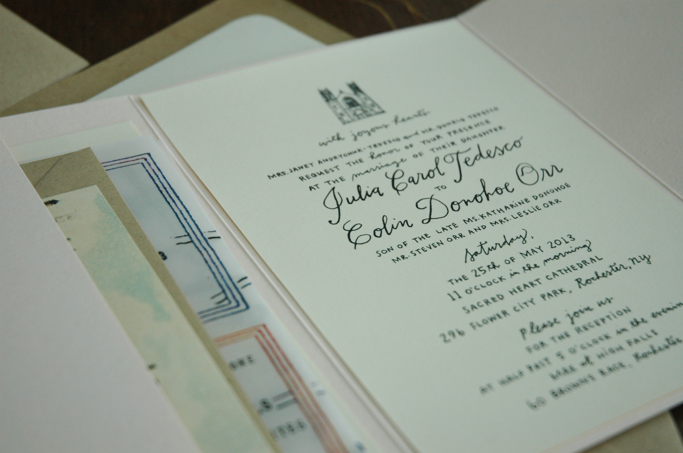
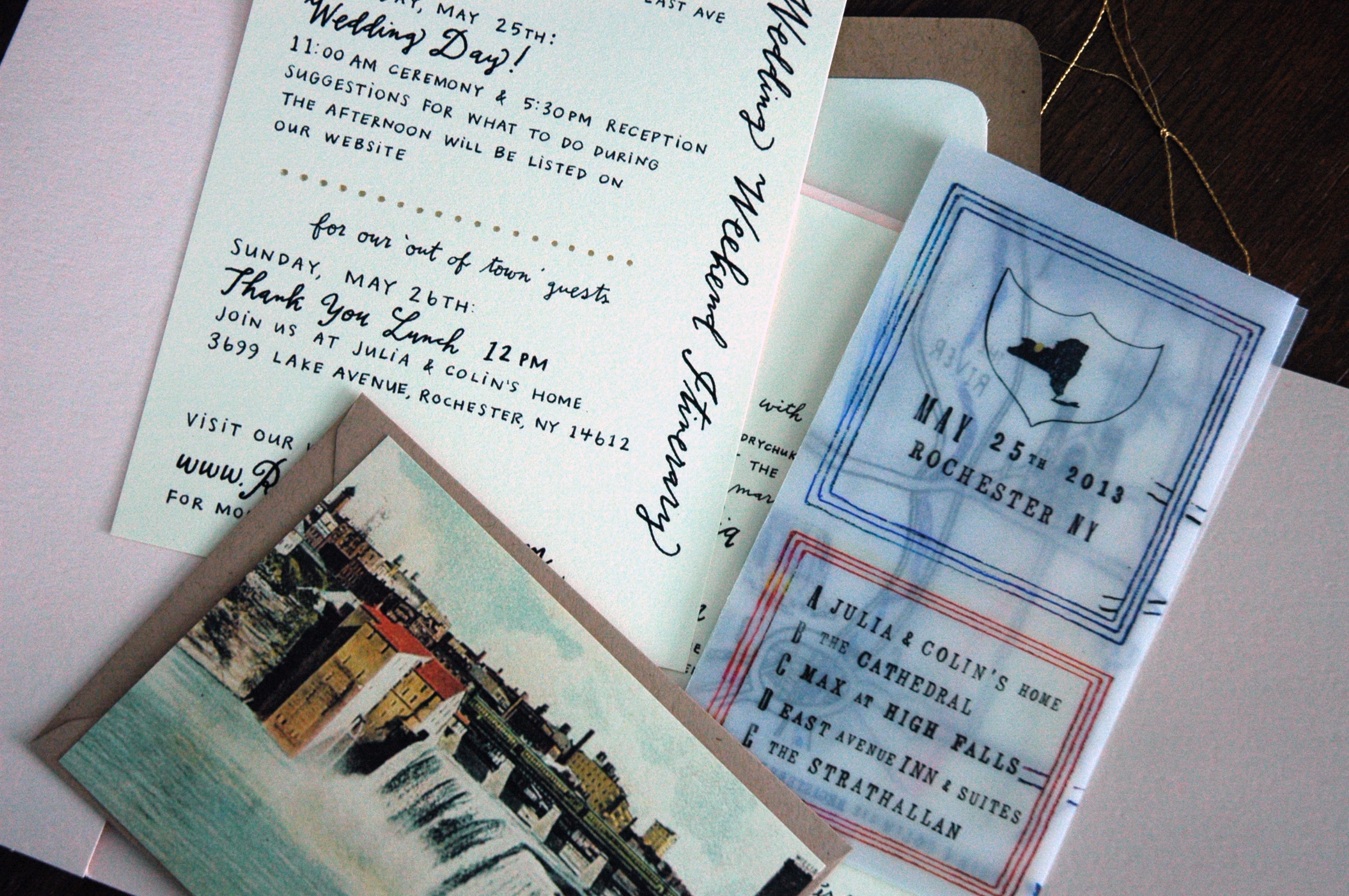
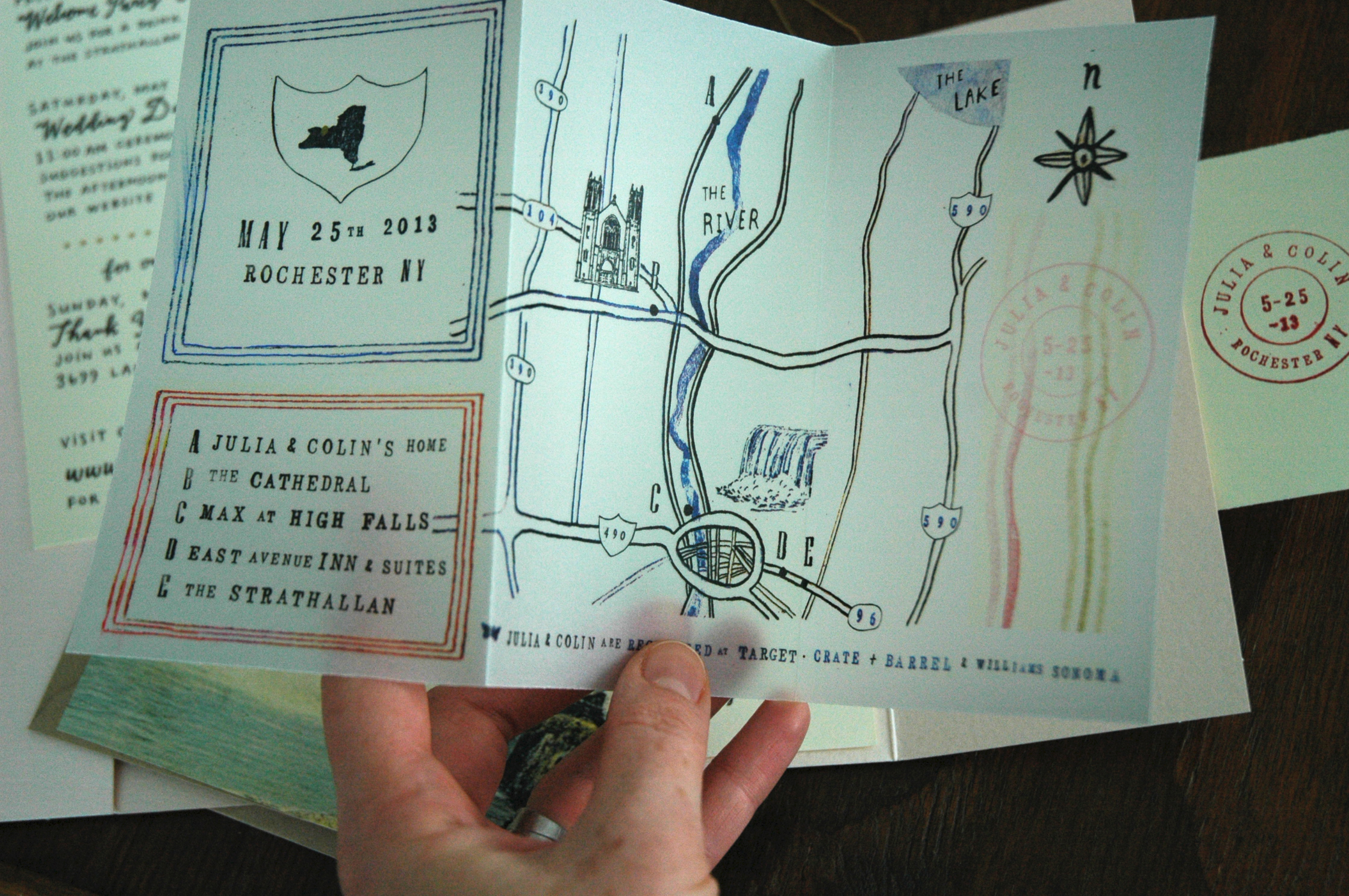
a most charming rochester wedding
I don't think I could have imagined a more lovely collaborative invitation than this. Each piece was given so much character, down to every last detail. Cecelia has a way of making magic happen with vellum, and is the only person I know that can give a building a cute personality. This was just seriously fun to work on, and how pretty is that blush color? Can't you just feel the love between these forever friends?